Mily
Oct - Dec 2021
Class Project (HCDE 518)
overview
―
Mily is a buddy finder app that helps women feel welcomed and motivated to hit the gym. On top of finding a gym buddy, people can also find like-minded groups to work out, and share tips.
project type
User Research
User Experience Design
role
User Research
UIUX Design
duration
8 weeks
team
Lily Liu
Yixi Liu
Ilia Savin
Meghna Balachandran
why this project?
―
With many gym enthusiasts in our group, we set out to address some of the main problems of working out in gyms as female students. Our motivation for pursuing this problem space came from conducting secondary research, which proved that sexual harassment and discomfort in gyms disproportionately affected young women.
Globally, women are less likely than men to get enough exercise: 57 percent of men ages 18 and over meet recommended aerobic activity levels, versus 49 percent of women, according to data from the Centers for Disease Control.
Stats about female gym members
what was the problem we were trying to solve?
―
How might we empower young women to hit the gyms with ease and confidence?
my main responsibilities
―
📌 Need-finding through primary and secondary research
1. conduct background research on gym experience
2. lead 6 in-depth interviews with female gym-goers
💭 Ideate and prototype based on key insights and goals
1. synthesize research findings and build personas with the team
2. concept-testing with potential users and stakeholders
3. prototype low and mid-fidelity designs with the team
👩🏻💻 Design, test, and iterate
1. build the visual design system for high fidelity prototype
2. conduct mini usability-testing sessions
3. iterate based on feedback
final designs
―
Personalized Gym Buddy Matching
Hit the gym with women like you!
Users will be able to meet gym buddies to work out together. Based on their needs and goals, they could:
find a gym buddy
learn from a gym mentor
become a gym mentor
Smart chat suggestions
Don’t know what to say? We’ve got you covered!
Meeting strangers could be awkward, so we prepared suggestions and tools for users to easily start and enjoy conversations:
recommended chat content
contextual tips for chat
fitness and health-related readings for share
Personalized event recommendation
Join a group class and bond with the community!
Apart from meeting individual gym-goers, Mily also recommends community events and group classes based on the users’ goals and needs.
Event/ group class recommendations
Join group chat
Speed Buddy Match
Feel like hitting the gym now? Try Speed Match!
Plans change quickly, especially when it comes to working out. With Mily, users could match with a buddy and hit the gym anytime when they feel like so.
Identity Verification
Making it trustworthy!
Going to the gym with people met online could sound like a terrifying idea. However, with our verification procedures, Mily allows users to meet buddies and grow together without safety concerns!
third-party log-in verification
photo verification
research methods
―
We used user interviews, field observation, and surveys to generate insights, inform our primary and secondary personas, and guide our future design decisions.
#1 - Survey
We chose to conduct a survey to answer the research questions of: What forms of discomfort do women experience at gyms? How do women deal with them?
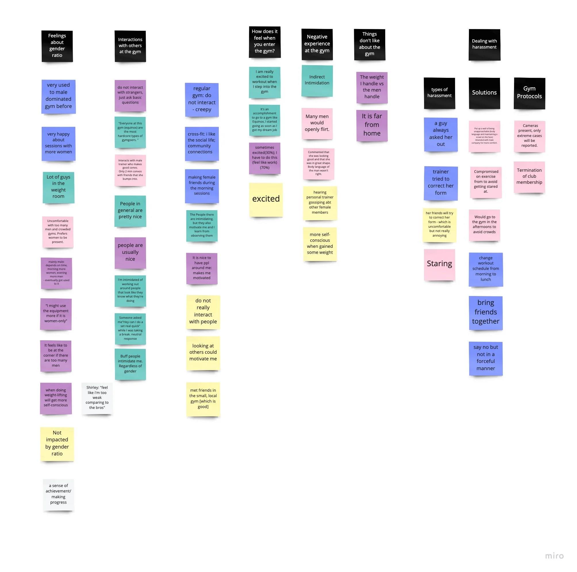
A total of 258 responses were received. Multiple choice or yes or no questions generated pie charts while short answers are analyzed through affinity diagramming.
#2- User Interviews (6 semi-structured)
Our team conducted 6 semi-structured qualitative interviews to share women’s experiences at gyms.
Our participants were gym-going women between the ages of 18-35 chosen based on their responses to the screening survey. We also conducted a stakeholder interview with a local gym owner in Seattle. Notes from the interviews were analyzed using affinity mapping and helped breathe life into our personas.
one of the affinity diagrams for interview findings
#3 - Field observation
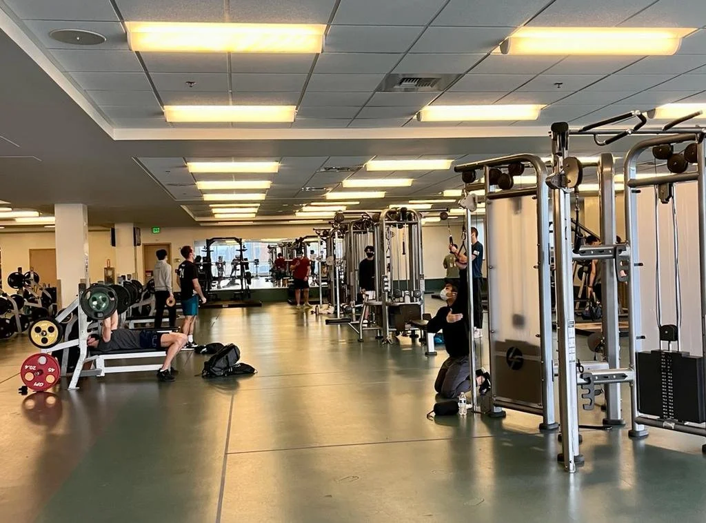
Independent observations were conducted by three people in four different spaces within the Intramural Activities Building (IMA) at the University of Washington. The goal is to understand how do behaviors and interactions vary with respect to gender within gym spaces? The researchers worked out in each of the spaces and took notes on their phones in between exercise sets to avoid being conspicuous and bias the participants.
strength training area at IMA
research insights
―
FINDING#1: Gender Ratio Affects Women’s Comfort Level at the Gym
The majority of women we surveyed reported negative experiences or feelings at the gym when they went to gyms with mostly men. Women who went to gyms with a relatively equal gender ratio are less likely to feel uncomfortable.
FINDING#2: Level of Experience Affect Women’s Comfort Level at Gyms
Among the people we interviewed, we noticed women with less experience at the gym are more likely to feel insecure or self-conscious at the gym.
FINDING#3: The Weight Room Can Feel Like A Forbidden Zone
When asked to recount uncomfortable feelings or interactions, most women mentioned the strength-training area, which is normally dominated by male gym-goers.
FINDING#4: Finding Partners or Joining Group Classes Are Popular Among Female Gym-Goers
Women who feel uncomfortable going to the gym normally choose to work out with friends or experienced partners. Some of them also reflected very positive experiences joining group classes where they could meet other female gym-goers.
Ok, problems identified. Time to brainstorm ideas.
STEP 1: who are we designing for?
―
Building personas help us to identify the main pain points - the MVPs for our project. With the primary persona identified, we are able to align on who we are designing for, and whose needs we need to address first.
Primary Persona
Secondary Persona
STEP 2: ideation
―
Based on research insights, we moved on to ideate possible solutions. During the meeting, we decided to think of both the good and bad ideas. The former pushes us to think creatively while the latter helped us think more critically about what features to avoid in our product.
🤩 THE BEST IDEAS
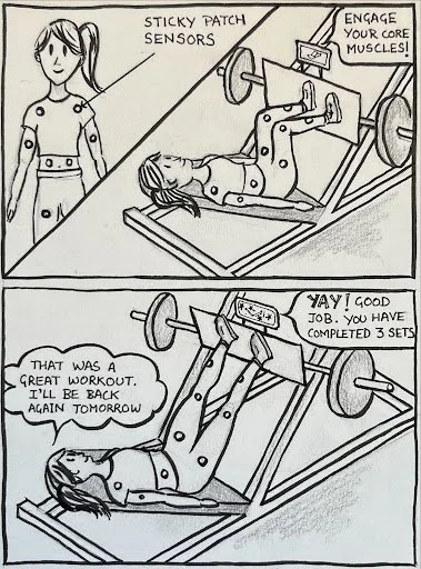
Build smart or wearable technology to create a personalized training experience at the gym.
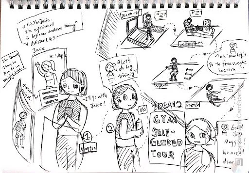
Design a self-guided tour with an AI assistant to help women navigate the gym space.
Build a social app where women could find a partner to work out together at the gym.
💩 THE WORST IDEAS
Ask an aggressive man to instruct women
Put new members in the spotlight
Divide people
our whiteboard brainstorming session
STEP 3: concept testing with stakeholders
―
To validate our concepts, we each spoke to gym owners, personal trainers, and potential users for an informal concept test. We showed our concepts to each participant and asked for their feedback and opinions.
Out of the 3 concepts, the buddy finder is most well-received. It helps to build accountability, motivation, confidence, and in general, foster positive and meaningful social interactions at the gym.
concept testing session with gym owners
Concept#1 - Wearable Device
Concept#2 - Self-guided tour + AI Assistant
Concept#3 - Buddy Finder - WINNER! 👑
Bring our ideas to life
“Going to the gym is more of a social experience. We want to make sure we are fostering a positive community rather than over-relying on fancy technology for solutions.” - Gym Owner Ren, from our interview
key design concepts
―
Gym Buddy
People set up their profiles first and get matched based on similar availability, workout exercise, experience level, and gender preference. If someone wants to find a gym partner on short notice, they can do a quick match.
Gym Mentorship
People could learn from more senior or experienced gym goers in the app. We encourage women to help and grow with each other as a community.
Workout Group
People can join workout groups based on their needs and preferences. Joining a group will help people learn about the space and community better in a more dynamic setting.
low-fidelity prototype
―
key screens for usability testing
user testing
―
Usability tests were conducted with 5 female-identifying participants who had access to the IMA building at the University of Washington. Based on feedback, we fixed usability issues and improved our design.
usability test conducted over zoom call
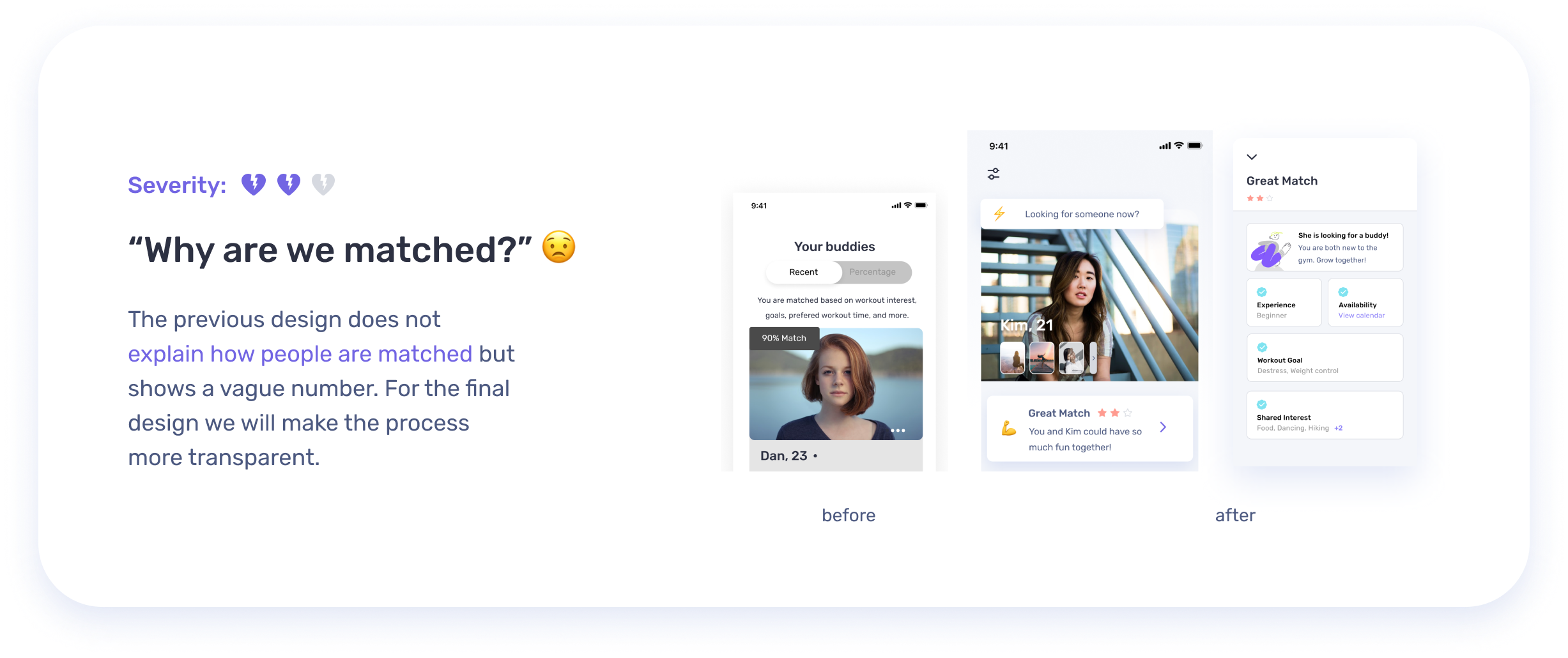
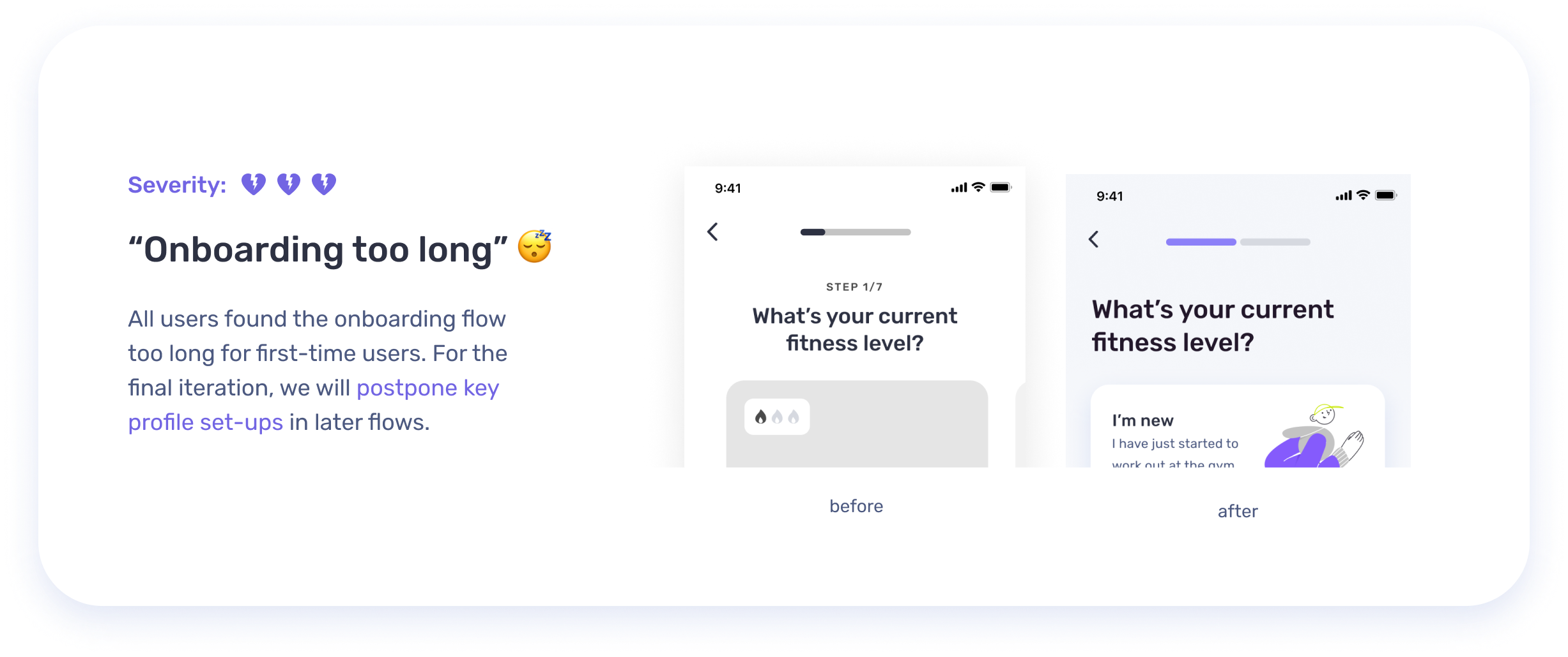
✍🏻Key feedbacks and design iteration decisions:
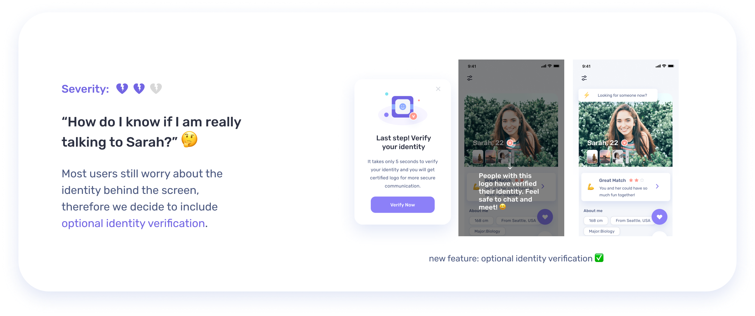
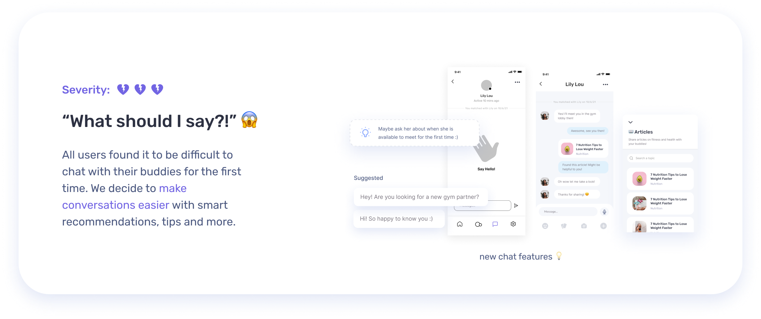
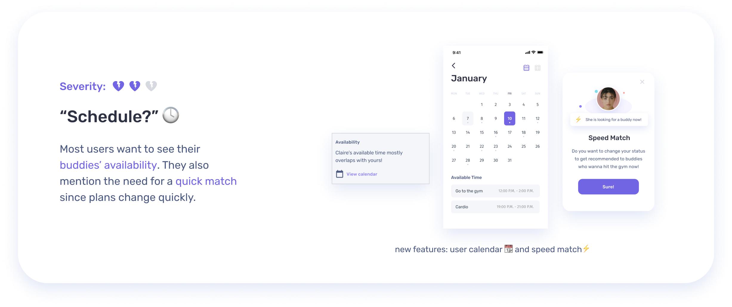
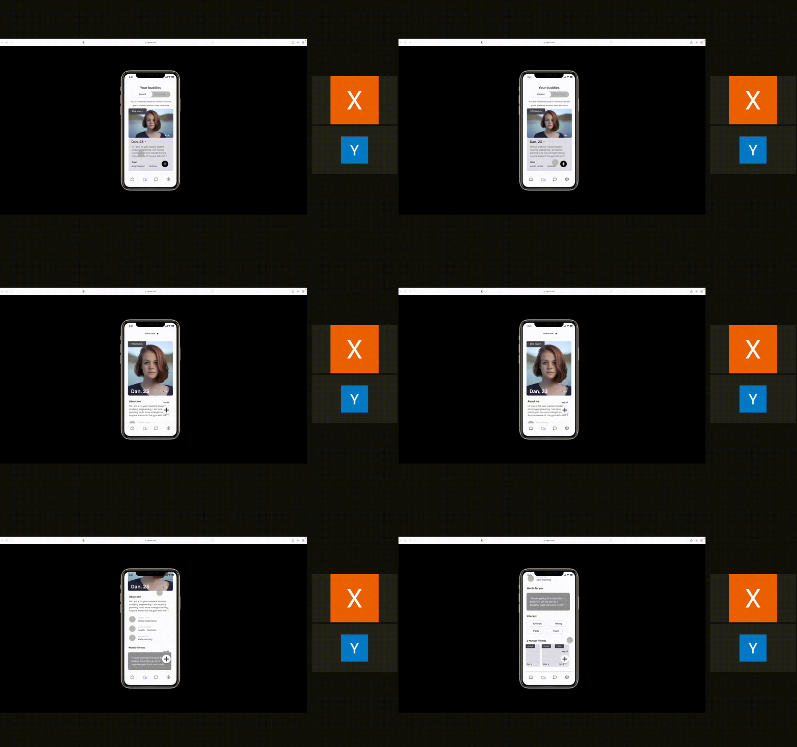
key user flows
―
Visual Guide
―
I further developed the visual style of Mily through the style tile. It serves as a synthesizing document of the brand ideas and inspirations gathered, incorporating logo design, color palette, typography, and imagery that guides UI design later.
UI Kit
―
UI Kit is a compilation of existing UI elements on the website that provides references for future design and collaboration for the design team. It is also a living document and will be updated whenever there is an iteration of the design.
📲✨👀
Want to see more? Have fun with the clickable prototype here :)
💜 my takeaways
―
Always ask users
After the ideation phase, we had so many great ideas. They were all our treasured ideas, and we couldn't decide which idea was the best one to pursue within our limited time frames. After a consultation with our instructor, we decided to do a casual concept testing with potential users and asked what they thought about our ideas. Users had an answer to the question we could not solve ourselves and offered us valuable inspirations.
Be specific about project scope
Although our team’s broad scope at the beginning helped us generate lots of ideas, it became confusing and overwhelming as we moved into prototyping. If we were to do it differently, we would have defined our project scope and core features earlier in order to use our limited time more efficiently.


