AllTechIsHuman Rebranding
Oct - Dec 2021
Class Project (HCDE 508)
overview
―
A redesign project for All Tech is Human, a non-profit organization that aims to diversify the tech industry through knowledge-sharing. My job is to understand client mission, and redesign their current visual systems, including branding, website, and marketing materials.
project type
Web Design
Visual Design
role
Visual Designer
UIUX Design
duration
8 weeks
team
This is a solo project.
👀
―
Take a look at the animated prototype for the rebranded website I made for AllTechIsHuman. The animation is done in Principle.
✨ Project Background
―
All Tech Is Human is committed to building the Responsible Tech pipeline; making it more diverse, multidisciplinary, and aligned with the public interest.
All Tech Is Human is a non-profit organization that has intentionally brought together a diverse range of individuals and organizations across civil society, government, and industry. Their aim is to grow the Responsible Tech field by promoting knowledge-sharing and collaboration among multiple stakeholders in order to co-create a better tech future.
✨ Design Goals
―
Based on ATIH’s values, missions, and personalities, I identified three design directions.
#01 ✨
Designing a fun and interactive experience that encourages involvement and action.
#02 🌈
Create a strong brand image that resonates with their personality & values.
#03 😜
Making the website digestible and easy to navigate.
🌈 Moodboard
―
😜 Logo
―
I decided to create a logotype and a pictorial logo for this organization. In the logotype, the smiley face replaces the character “U,” adding a sense of kindness and humor, while also serving as the pictorial logo when used on its own.
logo explorations:
⛓ Grid
―
🎨 Color
―
Our color palette is vibrant and energetic and conveys the power and energy of the grassroots community. Dark pink is our primary color, and when used consistently, it provides a strong, recognizable foundation for our brand.
There are three bold accent colors (Moroccan Blue, Green, and Yellow) that can be attention-grabbing when used in tandem with dark pink in our visual communications. There are also 4 grayscale colors (Black, Grey, and White) available for use within our palette.
🈂 Font
―
The new brand identity utilizes 2 font families (Sora & DM Mono). Primary headlines, longer blocks of copy, and less crucial headers are set in DM Mono Medium. Bold Sora is used for attention-grabbing headlines and materials.
🧩 Images
―
#01 PNG Images + Graphics
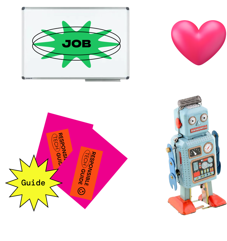
We collage and animate PNG images with transparent background to add to the overall welcoming, fun, and playful feel. Most PNG feature a retro-tech theme. They are also used together with graphic elements.
#02 Photos
Photos featuring communities, event images from the organization are used to show the works they do and their personalities. Halftone effect is applied to make a more vibrant and dynamic feeling.
🔫 Final Design
―
🖐🏻 my takeaways
―
Content + Functionality > Style
Be organized. Pay attention to details!
Plan ahead. (grid, responsive, animation, etc)


